The color of an exterior fence is more than an aesthetic whim: it can influence a buyer’s first impression and ultimately affect offers. A fence acts as a frame for your yard, so the chosen hue interacts with brick, siding, plantings, and light. Because prospective buyers often form judgments before they step inside, a loud or poorly chosen fence finish can make a property feel less appealing. In real estate terms, curb appeal is an immediate marketable trait, and fence paint is a simple, visible variable that contributes to it.
This article outlines common fence shades that tend to alienate potential buyers, explains the practical reasons those colors can be problematic, and recommends safer replacements. Throughout, the focus is on preserving or improving home value with minimal expense and effort. You’ll find actionable options—both colors and finishes—that harmonize with landscaping and architecture, plus quick styling tips to make the fence a supportive backdrop rather than the focal point.
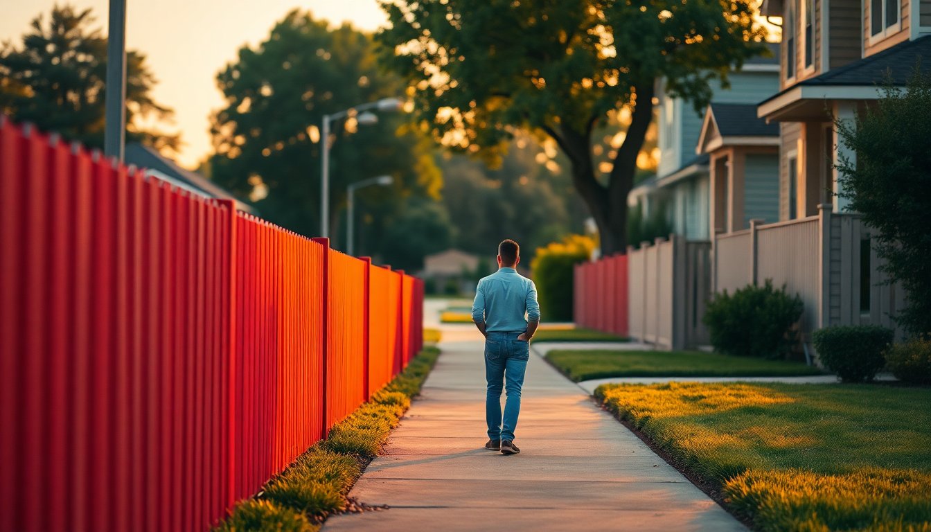
Colors that commonly deter buyers
Bright orange
Intense orange tones can feel energetic on cushions or planters but are usually overwhelming when applied to large exterior surfaces. Bright orange often clashes with natural brick or neutral siding and can dominate the visual balance of a façade. Over time, these saturated pigments are prone to uneven fading in sun-exposed locations, which can leave a patchy, tired appearance. Because repainting or replacing a fence is perceived as an added expense, many shoppers mentally deduct value when they see a strong, nontraditional color. A more market-friendly approach is to choose warm, earthy alternatives such as terracotta glazes or a rust tone wood stain.
Bold pink
Hot pink or bubblegum shades may read as playful in small accents but across an entire fence they often create an artificial contrast with green planting. This can make the outdoor space feel stylized rather than welcoming, limiting buyers’ ability to visualize the garden as their own. If a hint of pink is important to your aesthetic, consider a muted rose or a pink with grey undertones to soften the effect. Alternatively, introduce pink through seasonal flowers or climbers—this preserves personality while keeping the overall presentation neutral and broadly appealing.
Jet black
Deep black fences can produce a dramatic, contemporary look on larger properties with modern architecture, but on smaller lots they tend to shrink perceived space and make yards feel enclosed. Black finishes also absorb more heat, which accelerates drying and can lead to warping, cracking, or faster weathering of wooden panels. Buyers aware of potential maintenance headaches may react negatively to a fence that looks likely to demand repairs. For similar sophistication with less risk, opt for charcoal or slate grey tones that deliver a refined appearance without the extremes of pure black.
Neon or very bright green
Lime or neon greens can jar against natural foliage and create a chaotic visual field rather than a calm, cohesive garden. Highly saturated greens rarely blend harmoniously with lawns, hedges, and mature trees; instead, they compete with them. When prospective buyers imagine creating a private retreat, an overly bold fence color can interrupt that vision. Softer, botanical-inspired greens—sage, olive, or muted forest tones—work much better and still provide color while remaining understated and buyer-friendly.
Why these choices are risky
There are practical and psychological reasons certain fence hues harm resale prospects. On the technical side, high-chroma paints can fade unevenly and show wear faster, and dark surfaces can absorb heat leading to structural stress on wood. Psychologically, extreme or highly personalized palettes make it harder for buyers to picture the space as their own; a fence is one of the first things they see, so it affects the emotional reaction to the entire property. Buyers often prefer features that feel like a blank slate—something they can adapt—so neutral and mid-toned natural finishes tend to perform best when listing a home.
Safer alternatives and practical tips
Buyer-friendly color choices
When repainting, prioritize neutral tones such as white, beige, and taupe, which reflect light and create an inviting backdrop. For a natural, universally appealing option, mid-toned wood browns or transparent stains preserve the grain and suggest a well-maintained exterior. If you want a darker finish, pick charcoal or soft slate rather than pure black to retain depth without making the space feel smaller. Muted greens and earthy terracottas provide color while blending with the garden instead of clashing.
Styling and maintenance tips
Keep maintenance in mind: pale paints like bright white look crisp but show dirt in wet climates and demand more frequent touch-ups, while stains can be forgiving and highlight texture. If a personal pop of color is essential, introduce it through movable elements—planters, benches, cushions, or seasonal blooms—so the next owner does not inherit an expensive repainting task. Finally, aim for consistency with the house’s architectural style and neighborhood context; a cohesive approach enhances curb appeal and supports stronger offers.
Final thought
Changing a fence color is a relatively small investment that can have an outsized effect on how a property is perceived. Choosing a restrained, well-chosen finish helps present your yard as a flexible canvas for buyers, protects against premature weathering, and supports the goal of maximizing home value.


