Personal style in the home usually comes down to confidence: the freedom to make choices for yourself rather than staging everything for a future sale. At the heart of this approach is the idea of joyful decorating, an attitude that privileges personality over uniform trends. Still, professional designers often notice patterns that leave a space feeling less refined. Those instant reactions typically target items that feel mass-produced, overly themed, or simply out of scale with the room. Recognizing these common pitfalls helps you keep the spirit of personal expression while avoiding choices that read as tacky to design-savvy visitors.
What counts as tacky decor is not moral judgment but visual shorthand: some elements flatten a room’s personality or make it feel temporary. Designers name recurring culprits—everything from identical furniture suites to vertical blinds—that tend to make interiors appear showroom-stiff or dated. This article reviews those specific design choices, explains why they register poorly, and suggests alternatives so you can make deliberate swaps that preserve your individuality while creating a more considered look.
Common decor choices designers flag
Furniture and display choices
One of the fastest ways to rob a room of character is to rely on a full matching furniture set; when sofas, tables, and chairs come as a single, identical package, the space can feel like a staged showroom rather than a lived-in home. Alongside that, oversized family portraits hung immediately in the entryway can dominate the conversation and feel overly personal in public zones; designers often recommend relocating large family images to a bedroom or hallway. Similarly, mismatched novelty mugs and plastic picture frames convey a casual, improvised aesthetic that undermines cohesion—switching to a modest collection of cohesive dishware and investing in simple frames can make photos and objects look intentional instead of thrown together.
Plants, wall treatments, and wall decor
Greenery and wall surfaces are powerful style signals. Faux plants can work when they are high quality and used sparingly, but poorly made artificial florals quickly read as counterfeit and collect dust, killing the sense of life a room needs. On walls, the difference between a thoughtfully curated gallery and a cluttered collage is crucial: overcrowded gallery walls filled with random prints, inspirational quotes, or kitschy word signs often create visual noise rather than meaning. Wallpaper applied only as a single accent strip, especially in children’s bedrooms, can feel tacked-on; designers note that wallpaper makes its strongest statement when it wraps a space, creating an immersive pattern rather than a decorative sticker.
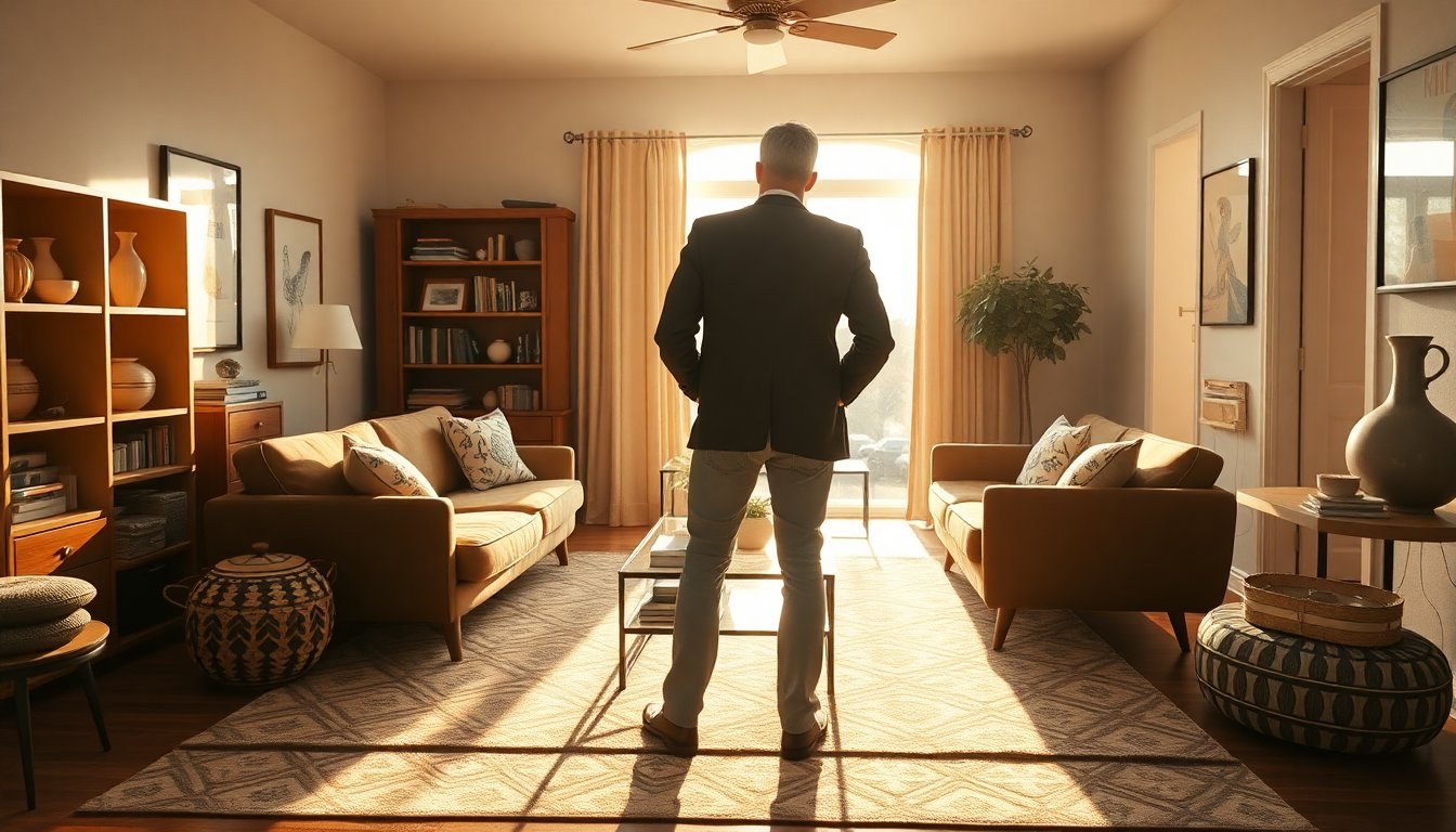
Window treatments, finishes, and theme overload
Windows and finishes are another place to avoid quick decisions that age a room. Cheap vertical blinds—especially on sliding doors—tend to look institutional and attract smudges, while ill-fitting curtains that don’t reach the floor make windows seem undersized and awkward. Similarly, builder-grade finishes like basic hardware and standard plumbing fixtures communicate a lack of refinement; replacing these with well-priced, stylish options immediately elevates a space. Themed rooms—think all-out coastal or holiday displays left up year-round—can also cross into tacky territory when the theme overwhelms personal meaning. Designers suggest restraint: a few authentic touches are more effective than a room committed to a single gimmick.
Why these choices feel dated and how to rethink them
Most of the items designers label as tacky share common traits: they’re overly generic, visually loud without narrative, or clearly mass-produced. For example, motivational posters and large printed instructions in bathrooms are functional but not necessarily decorative; they can be replaced with subtle, text-free art that invites interpretation rather than commands. Similarly, novelty mugs or year-round holiday decorations frequently read as nostalgic clutter instead of curated keepsakes. The antidote is intentionality: edit to keep objects that tell a story, invest in a few tactile, well-made pieces, and favor quality over quantity so that each element feels chosen rather than applied.
Simple swaps designers recommend
If you want quick wins, start small. Replace a set of vertical blinds with full-length curtains in a textured fabric, swap out builder-grade hardware for brushed or matte metal finishes, and trade plastic frames for a handful of modest wood or metal frames in consistent sizes. Mix furniture styles rather than buying a matched ensemble—pair a mid-century sofa with a vintage side table or an upholstered armchair with a modern coffee table to create a curated look. For greenery, choose one well-made faux plant or a real specimen with good light. These modest changes preserve the spirit of joyful decorating while moving your home toward a more polished, timeless presentation.


