
Argomenti trattati
The world of interior design is constantly evolving, influenced by cultural shifts, generational preferences, and emerging trends. Among the most notable trends in recent years has been the rise of millennial gray—a color that has become synonymous with modern aesthetics. However, as tastes change, this once-favored neutral appears to be on the decline. To understand this transformation, it is essential to explore the factors that led to the popularity of millennial gray, its impact on home design, and the colors that are beginning to take its place.
The Rise of Millennial Gray
To comprehend the ascendance of millennial gray, we must revisit the aesthetic landscape of previous decades. Baby Boomers and Generation X favored warm yellows and honey oak cabinetry, which often elicited backlash from younger generations. As millennials began to establish their own homes, there was a clear desire to break away from the design choices of their predecessors. This shift sought a fresh narrative that showcased sophistication, minimalism, and a departure from the overly warm tones that dominated the past.
According to interior designer Alice Moszczynski, the appeal of gray was deeply rooted in a response to the heavy beiges and Tuscan-inspired yellows that defined boomer homes. “Millennials wanted something cleaner, fresher, and more minimal,” she states. This desire for a modern aesthetic aligned perfectly with the rise of open-concept living spaces and minimalist influences from Scandinavian design. Sherwin Williams’s Agreeable Gray became a hallmark of this trend, exemplifying how gray could serve as a safe, versatile choice for many homes. It was seen as a calming option, contrasting with the browns of childhood homes.
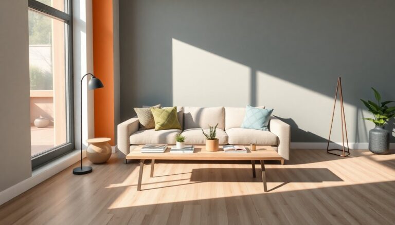
The Over-Saturation of Gray
However, as is often the case with trends, the initial appeal of millennial gray soon turned into over-saturation. Homes became inundated with gray—from walls to floors, cabinetry to furniture. The resulting aesthetic felt cold and characterless rather than the intended calming effect. Interior designer Terri Brien points out that while gray and white aren’t inherently bad, the execution often lacked personality, resulting in sterile environments. The pandemic exacerbated this issue, as people found themselves confined to spaces that felt more industrial than personal.
As a result, many designers have noticed what they term “gray fatigue” among clients. The once sought-after color has become associated with uninspired design choices. Moszczynski highlights the shift towards warmth and personality in interior spaces, noting that clients are now craving a return to earthy palettes. With Gen Z bringing patterns and vibrant colors into the mix, the once-dominant neutral is being re-evaluated.
Embracing Warmer Tones
As the industry moves away from a reliance on millennial gray, there is a growing preference for shades that evoke warmth and comfort. Designers like Megan Pflug are embracing creamier hues such as Farrow & Ball Shaded White and Sherwin-Williams Roman Column, which offer a fresh take while still maintaining a modern feel. For those hesitant to abandon gray altogether, greige—a blend of gray and beige—serves as an ideal transitional color, providing an inviting atmosphere while remaining contemporary.
Pairing colors thoughtfully can also enhance the overall aesthetic of a home. By balancing gray with earthy tones, homeowners can create a soothing environment that feels both stylish and cozy. The term “Millennial Green,” coined by Gen Z, illustrates this preference for shades like sage and olive, indicating a shift toward more vibrant, nature-inspired hues. Ultimately, there is no such thing as a “bad” color; rather, it is about how they are combined and utilized within a space.
Strategic Use of Gray Going Forward
So, can millennial gray still hold a place in modern interiors? The answer is a resounding yes, but it requires a shift in approach. To maintain its chic appeal, gray should be applied strategically and in moderation. Designers suggest using gray as an accent rather than the primary color, allowing it to complement warmer elements in the design. For instance, a moody charcoal accent wall can beautifully contrast with warm wood tones, creating depth and interest.
In a guest bathroom renovation, designer Sherrell Neal showcased how gray can still be relevant by pairing Benjamin Moore’s Gray Owl with complementary colors and finishes. The subtle interplay of cool and warm shades created a cohesive and timeless look. As we move forward, embracing a palette that celebrates the complexity of color—where gray serves as a supporting character rather than the star—will allow for a more inviting and personal home environment.