
Argomenti trattati
When it comes to health and wellness, one crucial aspect often flies under the radar: sleep hygiene. It’s not just about how you wind down with a warm shower or meditation; the aesthetics of your bedroom play a significant role too. Did you know that the colors on your walls can influence not only your mood but also the quality of your sleep? Yes, it’s true! Various studies show that different hues can elicit emotional responses that either enhance or disrupt your sleep experience. So, let’s dive into how the paint or wallpaper in your bedroom might be affecting your nightly rest.
The Psychological Influence of Color
Choosing a color for your bedroom is more than a mere design choice—it’s a decision that resonates deeply within your subconscious. Experts agree that color can impact our emotional and physiological states. For example, certain shades can promote calmness, while others might trigger excitement or even anxiety. Psychologist Leah Kaylor notes, “Colors can either relax us or keep us alert.” When picking your color palette, it’s vital to consider how it might affect your mental state, especially in a space meant for relaxation.
High-contrast or overly vibrant colors, like red and neon yellow, can lead to sensory overload. Kaylor warns that such bold colors can keep your brain on high alert, which isn’t exactly helpful when you’re trying to unwind. Bright patterns can also distract your mind, resulting in fragmented sleep or increased wakefulness throughout the night. This becomes even more critical for individuals dealing with anxiety or PTSD, as they may struggle to achieve restorative sleep in such environments.
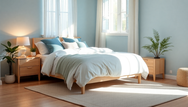
Colors to Embrace and Avoid
While some colors can negatively impact your sleep, others can help create a peaceful atmosphere perfect for relaxation. Soft, muted tones are generally recommended for bedrooms. Think gentle floral patterns or nature-inspired designs—they’re considered great picks because they evoke tranquility and fit within more subdued color palettes. Interior designer Kathy Kuo suggests these options as they encourage a peaceful environment that supports good sleep hygiene.
Speaking of serene settings, shades of blue deserve a special mention for their calming properties. Deep navy or soft teal are often recommended, as they remind us of serene waters and promote relaxation. Earthy hues like green—particularly lighter shades such as mint and sage—can also enhance this calming atmosphere. Isfira Jensen goes further by suggesting wallpaper designs with flowing lines and gentle motifs, as they create a harmonious visual experience that can soothe the mind.
Practical Implementation and Alternatives
Now, if a full redesign isn’t in your budget, don’t worry! There are still plenty of strategies you can use to optimize your sleep environment with color. If your current wallpaper or paint color isn’t ideal, consider introducing softer lighting or incorporating visual breaks to offset any strong patterns. Colin Pearson, an interiors expert, points out that even small changes can significantly enhance your bedroom’s ambiance. Exploring softer, more neutral tones like beiges, muted pinks, or deep greens can create a peaceful sanctuary that promotes better sleep.
Ultimately, the goal is to curate a space that aligns with your personal sense of calm and comfort. The choices we make regarding color, texture, and design can profoundly influence our sleep quality. By understanding the psychological implications of color in our sleep environment, we can create a sanctuary that not only looks fantastic but also contributes to our overall well-being. So, what color will you choose for your dream bedroom?