
Argomenti trattati
Why blue is a timeless choice in home decor
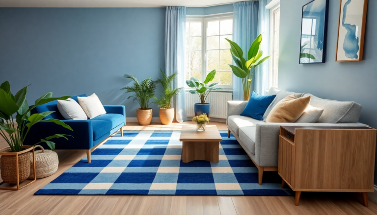
Blue is more than just a color; it embodies versatility and timelessness. From cobalt to navy and sky to cornflower, shades of blue can seamlessly fit into any home environment. The ability of blue to evoke feelings of tranquility, reminiscent of the sky and sea, makes it a perfect choice for creating serene spaces, such as bedrooms and spa-like bathrooms. Not only does blue blend effortlessly with various design aesthetics – whether minimalist or maximalist – but it also stands out as a neutral that can elevate any room.
Finding the perfect color pairings
Choosing complementary colors can be a daunting task, especially if you’re not a color consultant or interior designer. However, understanding the nuances of color theory can make this process much easier. We’ve compiled a list of 35 designer spaces showcasing how different hues can enhance blue, proving that this color can work in harmony with almost any shade. By exploring these combinations, you can transform your home into a cohesive and stunning space.
Bold and warm color pairings
For those looking to make a statement, pairing blue with bold warm colors can create a striking visual impact. In a San Francisco apartment, designer Caitlin Jones Ghajar opted for a warm yellow velvet bed frame to contrast a fanciful chinoiserie wallpaper. This pairing not only highlights the beauty of blue but also ties the indoor aesthetic to the breathtaking Bay views outside, showcasing how color can connect different elements of design.
Grounding blue with earthy tones
In Amber Lewis’ kitchen, duck egg blue cabinetry is beautifully contrasted with rust red and cream floor tiles. This combination demonstrates how light blue can serve as a versatile neutral, especially when paired with warm tones that ground the space. The use of earthy colors helps to balance the cooler shades and creates a welcoming atmosphere, perfect for gathering with family and friends.
Creating depth and drama with color
Using contrasting colors can also enhance the drama of a room. In a kitchen designed by Melissa Anderson, deep black accents add a modern touch to slate blue cabinetry. This graphic pairing not only creates a sense of sophistication but also respects the lush nature visible through the windows. It’s a perfect example of how blue can play well with darker colors, adding depth without overwhelming the senses.
Classic blue and yellow combinations
One of the most cheerful and timeless combinations is blue and yellow. Elevating this classic pairing by introducing a hint of green, such as chartreuse, can add a fresh twist. In a guest room designed by French & French, the cool light blue walls prevent the color scheme from appearing overly vibrant, creating a balanced and inviting space.
Monochromatic palettes for a serene look
Monochromatic color schemes can be incredibly impactful, especially when utilizing various shades of blue. Mark D. Sikes’ living room exemplifies this technique, where deep blue upholstery grounds lighter blue walls and ceilings. This immersive approach not only creates a cohesive look but also provides a calming environment, perfect for relaxation.
Adding texture and glamour
Incorporating metallics can elevate blue from everyday to glamorous. Suzanne Kasler’s living room showcases how brass and bronze accents can enhance the beauty of blue, adding texture and sophistication. This technique can be used in various settings to create a more luxurious feel, ensuring blue remains a standout feature without appearing too plain.
Finding inspiration from nature
Nature is an endless source of inspiration for color pairings. A chic powder room featuring a navy sink surrounded by floral green wallpaper demonstrates how blue can harmonize with natural elements. This cheerful palette not only brightens smaller spaces but also infuses them with a sense of joy and life.
Experimenting with unexpected colors
While blue is often paired with soft pastels, it can also work surprisingly well with bold colors. The contrast of a red upholstered bed frame against teal walls in a bedroom designed by Lisa Tharp adds a dramatic flair while maintaining a cohesive color story. This unexpected pairing shows how playing with color can result in a unique and sophisticated aesthetic.
Ultimately, the possibilities for pairing blue with other colors are endless. Whether you prefer warm tones, earthy hues, or bold contrasts, there’s a combination out there that will enhance your home decor and reflect your personal style. Don’t be afraid to experiment; the right colors can transform your space into a stunning sanctuary.